


Part 3: 1-N Product Management
What's the Impact?

In Part 2 of 1-N product management, I have explained the importance of maintaining a merged backlog and practical ways of doing so. This is what allows you capture the “Tasks” needed to address business problems in different areas.
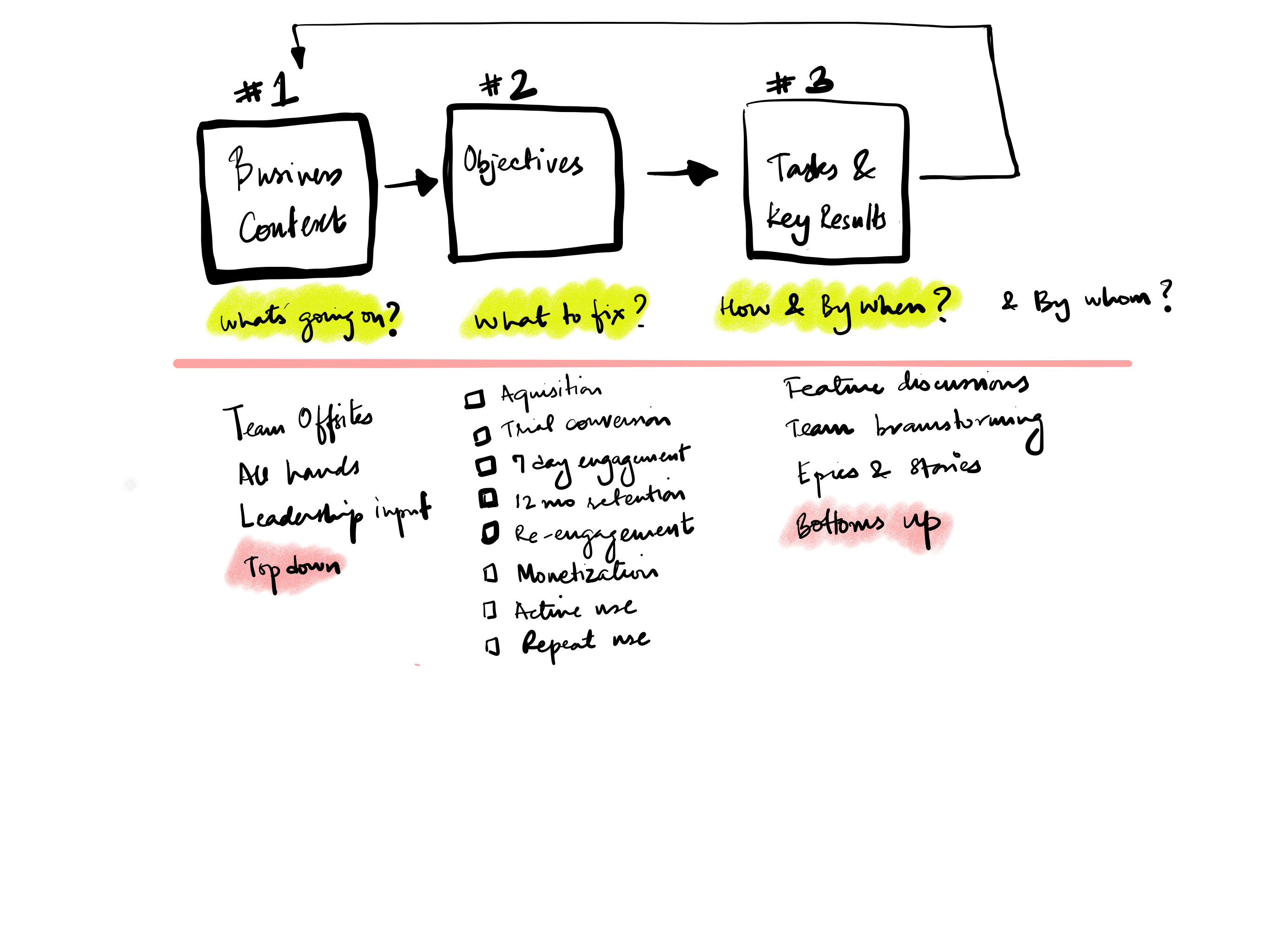
Now that you have a list of items, how will you prioritise them? How will you know what is the important thing to do in each area? What will be the impact of releasing new functionality or fixing broken experiences?

This is hard and starts by documenting baseline behaviour. While most new products are measuring everything, established products have to ensure that existing product analytics provide the answers you are looking for.
Often, the first thing we have to do is to fix the analytics in a particular area of a product before introducing new functionality in that area.
Once you have the baseline data documented, you should be able to answer the following questions:
In the business context, which areas need attention?
What percentage of your target user discover new value?
What percentage of your monthly or weekly launchers use functionality in this area of the product?
What is the usage trend?
Do users try once and never try again or there is healthy repeat usage in that area?
Once you have the baselines, you can figure out if you are able to impact of the past metrics with your interventions (features, UX fixes, etc).
So how do you evaluate each idea in the backlog.
Varun Sharma on my team came up with a straightforward way to place ideas on a 2x2 matrix. Expected frequency of use on the y-axis expected percentage of users that might use the feature. Here is what is looks like

It is useful to divide the area in the graph into a grid

And colour code the zones

Now plot your items in these zones. Argue with the team members until you agree on the impact. Try to make sure that you use past usage to predict expected usage. This is a very clarifying exercise.
Generally, it is very hard to introduce new functionality in an established app and get > 20% users to use it.
Also unless you are working on over all stability and performance of the application, it is very hard to find any items that end up in the top right box in this table. Fancy new feature ideas that demo well generally end up in the bottom left. This is because it is hard to get existing users to adopt new features, especially if it is easier for them to do things the old way or if your estimation of the usefulness of a feature is higher than that of your users.
When there is new learning involved, adoption is slow.
If you are building something new, rely on what the beta users are telling you. Run a systematic process to find out:
Are beta users discovering this functionality in a crowded product?
Are beta users using it repeatedly?
If not, you will not get usage post release. Marketing is largely ineffective is driving usage of new features in a established products
Remember, your beta users already like you and are incentivised to try new things.
When we were planning the work for this year. The Illustrator team went through over 100 ideas. We put them all in a spreadsheet.
We categorised each idea.
We listed which segment of users was the idea for.
We estimate how many users in that segment might use that functionality.
We estimated the impact of each idea.
We prioritised items in categories where we were deficient over areas where we were doing ok or well.
We sized each item (S, M, L, XL) from an engineering and design point of view.
We plotted items by size vs impact.
We grouped items by category
We tried to tell a story that explained the why behind our picks for the year to the executive team.
Email me if you want our prioritisation spreadsheet and want to see how we looked at items in the backlog.
In Part 5, I’ll cover what to do post ship.
—Anubhav